Hiroshima Mon Amour
Posted: December 10, 2014 Filed under: Constellation, Level 5 Constellation, Mannerism | Tags: death, Film, Hiroshima, Hiroshima Mon Amour, love, Mannerism, suffering Leave a commentThe film was made in 1959 and directed by Alain Resnais. The film tells a story of a French actor who is filming an anti-war film in Hiroshima and has an affair with a married Japanese architect. The two main characters interchange their perspective in war and on love. The film was nominated for Oscar in 1959 for best writing, story and screenplay, won the BAFTA awards for Best director (1959), nominated for Palme d’Or for Alan Resnais, won New York Critique Circle Awards for Best foreign language film (1960) and among many others.
The film was considered to be ahead of its time. It used flashback technique which was innovative to the time. The story is also tell about love and suffering by presenting the remembrance of the horrific event through newsreel and documentary footage, the phase is slow yet calculated, repetition in words and ideas. This techniques is effective in engaging the audience with the story and creates emotion also memory of feeling of love and happiness.
Here’s the trailer. The film is worth watching.
“Ugly” and “Strange” in art and design
Posted: November 13, 2014 Filed under: Constellation, Level 5 Constellation, Mannerism | Tags: Quentin Massys, The Ugly Duchess, Ugly Leave a commentUGLY
There is no positive without the negative. There would be no beauty without ugliness. The definition of ugly to me lays on the assumptions of ugliness. For example portraits that are showing who they really are instead of what they look like (realistic face).
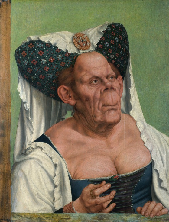
In Quentin Massys’ The Ugly Duchess he painted a satire of an old woman (in around 1513) who try to recreate her youth. She is wearing a beautiful old fashion dress and headdress. Her face is ‘unnatural’ shape. The wrinkle on her skin tells how old she is, which most probably more than a hundred years old. She is holding a red flower which indicates that she is looking for companion.
In this painting, Massys is depicting an woman who suffered from a malfunction of bone disease (Paget’s disease).
Therefore, I think he is showing us to look beyond the portrait.
The Ugly Duchess – http://en.m.wikipedia.org/wiki/The_Ugly_Duchess#/image/File:Quentin_Matsys_-_A_Grotesque_old_woman.jpg date: 13/11/2014
STRANGE
Strangeness is presenting subject matter through different points of view so that the viewers would see the world in a different way or strange and unfamiliar way in order to extend its perceptions.
In my illustration, these technique could help me express the unseen within the narrative, the invisible to our eye without being literal which therefore could give more understanding and have more meaning.
Reality in Art & Design
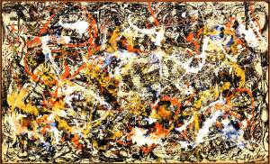
Posted: November 13, 2014 Filed under: Constellation, Level 5 Constellation, Mannerism Leave a commentOne of the most famous work of Jackson Pollock is Convergence, which was painted in 1952 (oil on canvas). He’s one of the leading figure in the American expressionist art movement. The painting embodied the American ideals of freedom of speech and expression.

Jackson Pollock – Convergence, 1952 http://uploads2.wikiart.org/images/jackson-pollock/convergence-1952.jpg – date 13/11/2014
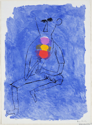
In the same year, below screenprint and watercolour painting was created by Ben Shahn (Lithuanian American). Not many people knew about this painting at the time. It represents the lives of industrial workers, farmers and families. He used his work as a voice against injustice.

Ben Shahn – Tripple Dip, 1952 http://www.moma.org/collection//browse_results.php?object_id=68193 – date 13/11/2014
There was tension between the US and the Soviet Union. The western believe that the spread of communism anywhere threatened democracy and capitalism everywhere. Therefore, communism needed to be contained by diplomacy, by threats and even by force. Unbeknownst to the artists, American Expressionism movement was funded by the CIA (used as propaganda tool vs Soviet oppression). The CIA appreciated his style because it does not express social realism and communicate political gesture. Meanwhile there was a rising in civil rights movement spoke out against inequality and injustice (African Americans and feminist).
In my opinion, the art is still very much influenced by who have the power to control (i.e. money, politics or religion). What I think is best to do is to keep my perception open and always see things from different perspectives so that the art will not be bias.
Rietvield Schroder House
Posted: November 13, 2014 Filed under: Constellation, Level 5 Constellation, Mannerism Leave a commentThe house was designed by Gerrit Rietvield in 1924 for Truus Schroder. The house is influenced by Neo Plasticism (artists and architects). The design is a head of its time. Composition is portrayed in multiple layers and is simplified in vertical and horizontal lines, form, shape, colour and transparency. The Use of primary colour creates a negative and positive space. Open space with changeable partition walls that can be adjusted based on the need of the people who live in it. It creates a sense of the outside is inside. The material, architects and resistance of the matter influenced each other to create mutual involvement.
Introduction to Mannerism
Posted: November 7, 2014 Filed under: Constellation, Level 5 Constellation, Mannerism | Tags: constellation, Lecture, Mannerism Leave a commentMannerism art movement began in 15c. The term developed from italian word Maniera or style in painting, sculpture as well as architecture. Artists are beginning to defy the guideline from the power that be (i.e religion/church).

