Perspective – Amanda Sue Rope workshop
Posted: January 10, 2014 Filed under: Artist Workshop, Subject Leave a commentIt was a pleasure to be able to learn from an Artist that I admire. Amanda Sue Rope came and gave us lecture and workshop on perspective. Her artworks were a big inspiration for my colour workshop project.
Perspective is the views from we see or other people see of the object. It also about positioning of people (who they are or what they do) and whether it is a vertical, horizontal and symmetrical positioning. Perspective also means where do an artist want the viewers to view the artwork to be. Perspective also create space within a space.
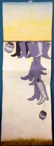
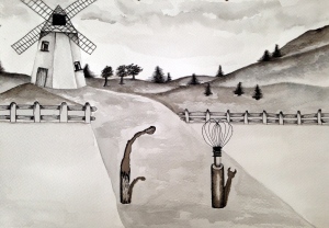
In the workshop, I was given three random images which I can paint or collage with and three situation words to set up a composition e.g: inside, close-up and isolated.
I collaged the images (crochet yarn, a boot and a badminton racket) horizontally on a paper with a starting point and incorporated the situation words to create an image that visually communicates the composition.
Here’s my image:
Prophecy
Posted: January 10, 2014 Filed under: Prophecy, Subject | Tags: animation, Hugh Cunningham, prophecy, stop motion 3 CommentsThis project was set up to explore the role of illustrator in predicting the futures: How Things Will Be – How Things Might Be – How Things Should Be.
I’ve chosen Childhood as the theme of this project. My main research source is “The Invention of Childhood” by Hugh Cunningham. It explores the questions of ‘What is a child, or to be a child?’. In my research I’ve encountered the developing world of simulation, projections, prediction and forecasts. The reformation and reinvention of the childhood innocence is what I want to explore in this project.
I’ve also exercised narrative story building using the character, setting and circumstance and also time and sequence during the making of the final work for the project.
I’ve never made a stop-motion animation before. It was quite a hard learning process. I’ve learnt that preparation is the a main key of a successful outcome. Considering it’s my first stop-motion production using the most modest software (iMovie) out there, I am pleased with the final work.
4 Images imagining a sequence happening in a year
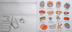
Posted: November 18, 2013 Filed under: Subject, Time Passing | Tags: celebrations, Illustrations, Japanese, sashimi, Sushi, TimePassing Leave a commentIn this storyboard, I wanted to represent the events or celebrations within a year that uses one same colour, red. The idea is to narrate an experience of a sashimi dish have through a year. I chose not to draw the faces of the sushi shop customer because I wanted to emphasise more on the event/celebrations instead of the people celebrating it.
12 Images of a sequence happening within 10 minutes
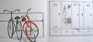
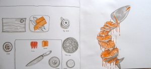
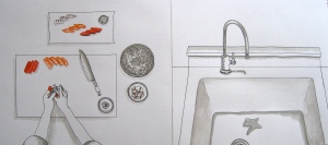
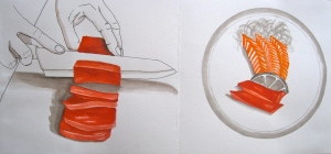
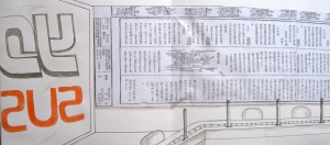
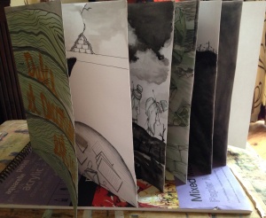
Posted: November 18, 2013 Filed under: Subject, Time Passing | Tags: Illustrations, Sushi, TimePassing Leave a commentThis storyboard is inspired by the chef at the Yo Sushi while preparing to cook sushi and sashimi. The story begin with the chef coming to work on a bicycle. I’ve made the storyboard into a constantina book with 20cm x 21cm each page.
20 Images of a sequence happening within an hour
Posted: November 18, 2013 Filed under: Subject, Time Passing | Tags: parcel delivery status, Saul Steinberg, Sushi, TimePassing, Yo Sushi Leave a commentThis storyboard was inspired by an email I’ve received from a delivery company about my parcel delivery status. It pointed out a link for me to go and check the movement of the delivery driver who was scheduled to deliver my parcel within an hour.
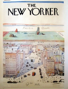
Based on that email, I took reference in one of Saul Steinberg’s work “9th Avenue”. It’s a landscape illustration for the New Yorker from a point of view at the 9th avenue in New York city, NY that expanded into a world map.
image source: http://www.juliasantengallery.com/blog/wp-content/uploads/2012/12/New-Yorker-2306.jpg
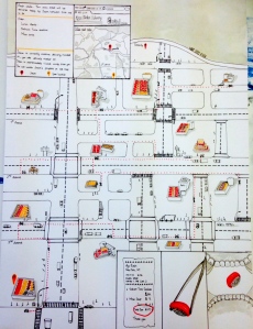
and here is my 20 images of sequence happening within an hour:
The size of the storyboard is A2, drawn with pen, ink and felt tip pens. Only Black/white and one colour are allowed. The map is latest the 3rd ave map in New York City, NY view from Google Earth.
It’s telling a narrative of my online sushi order journey that took place within an hour. The track of the delivery man can be followed by the red dots line.
Time Passing
Posted: November 18, 2013 Filed under: Subject, Time Passing | Tags: narrative Leave a commentThis next project is about recording passing of time with sequences and narrative. The Object (a place) is free to choose and drawn with observation. We are encouraged to see and observe our object so that it lets you breathe in its strange special air.
POSSIBILITIES and SUBJECT
- Rhythm
- History
- Seasons
- Mortality
- The Future
- Ageing
- Movement
- Measurement
- Recording of time, and
- When time stand still
The sequences can be of changing appearances, changing a constant, specific events and abstract representation. Symbol is one of a good way to represent abstract narrative. The narrative will be drawn from experience and reality. It is also can be wordless. It can be compressed or expanded. The aim is to allow the readers, actor or authors to share experiences.
My choice of object (a place) is Yo Sushi shop situated in St. David’s mall, Cardiff. I chose it because it’s one of my favourite place and feel comfortable to be in. The shop manager was generous in letting me sit there and watched them preparing their food to cook and work before the shop was open. I’ve also took pictures to help me capture the moments.
One thing to remember is to take different viewpoints of our chosen object (a place), e.g birds eye, inside looking out, outside looking in, from bellow, through the eyes of a cat, from inside a character’s head, zooming in and panning out and looking through something which obscures our vision.
STORYBOARDING
- 20 images showing a sequence happening within the space of an hour.
- 4 images imagining a sequence happening within a year.
- 12 images showing a sequence happening within ten minutes, and
- 7 images showing a sequence happening within a week.
The Trenches
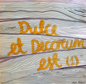
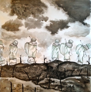
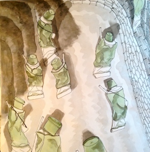
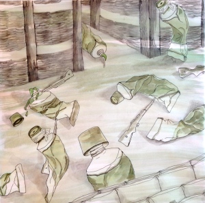
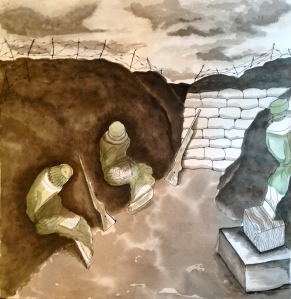
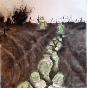
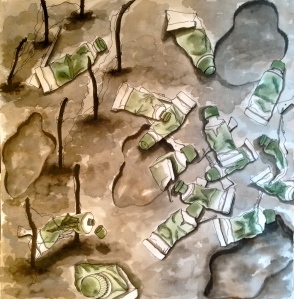
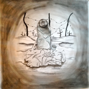
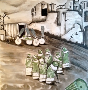
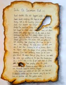
Posted: November 3, 2013 Filed under: Personification, Subject, Trenches | Tags: Dulce Et Decorum Est, Personification, Trenches, Wars and Conflicts, Wilfred Owen, World War I 3 CommentsHere is my final images of The Trenches project based on Wilfred Owen’s poem Dulce et Decorum Est (1).
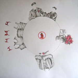
I wanted to set the book from a second person point of view. Here I have illustrated a mother reading her soldier son’s letters sent from the war. Her mind remembering the time when he went to war.
This image is to depict the gas attack inside the trenches. Here the soldiers had to hold urine-soaked cloth over their faces in an emergency of mustard gas. Thousands died of horrific deaths.
Here, I wanted to create senses of lost and loneliness because his friend had died.
Personification: Part Deux
Posted: November 3, 2013 Filed under: Personification, Subject, Trenches | Tags: Dulce Et Decorum Est, Personification, The Trenches, Wilfred Owen, World War I 2 CommentsTHE TRENCHES
The second personification project is depicting poems of World War I. We are given the freedom to choose between Dulce Et Decorum Est (1) by Wilfred Owen and The Hollow Men by T.S. Eliot.
Before making my decision on which poem I will be depicting, I researched facts and history of World War I. The war began in 1914 and ended in 1918 in Europe. It was started with the assassination of Archduke Franz Ferdinand of Austria and his wife by the Serbian act of terrorism. The war involved two most powerful influence in the world, the Alliances (British empire, France, Russia, Italy, Japan and the U.S) and The Central Powers (Germany, Austria-Hungary, Turkey & Bulgaria).
Fifteen million people were killed and twenty million troops were wounded. The trenches network stretched approximately 25,000 miles from the english channel to Switzerland. It was invested with rats, frogs and lice not to mentioned diseases like dysentery, typhus, cholera, gang green on wounds which slowly killed soldiers and influenza epidemic. The war was also the first war that used chemical weapon (chlorine gas) which also known as mustard gas.
The war left thousand of soldiers disfigured and disabled but also with horrific face disfigurement. The war ended with the The Treaty of Versailles. The war left Britain with huge debts, high unemployment and slow growth of economy. Britain lost its power in the leadership of the world and lost its sense of cavalry, heroism and nationalism and had driven Germany into deep recession. The war is also known as The War to end all war.
Source: http://facts.randomhistory.com/world-war-i-facts.html
I decided to depict Wilfred Owen’s poem because the poem was written based on his experience as a troop in the WW I. It described what he saw, experienced and felt vividly. He suffered from shell-shock and fever which encouraged him in writing the poem. He was shot and killed in the war, seven days before it ended.
Source: http://www.bl.uk/onlinegallery/onlineex/englit/owen/
CASTING
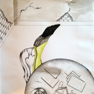
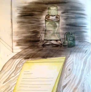
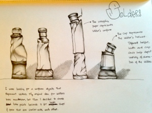
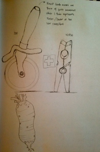
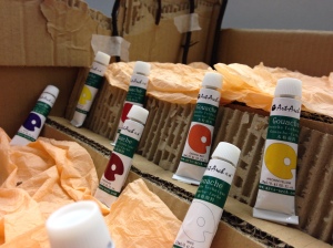
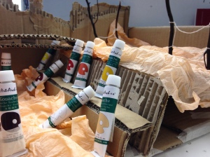
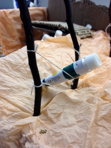
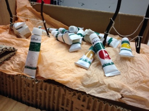
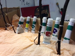
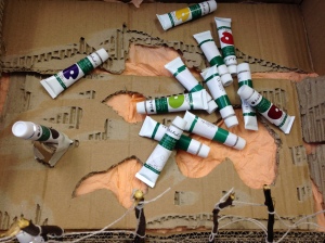
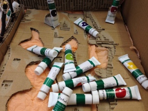
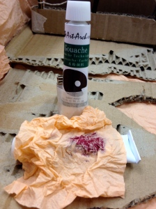
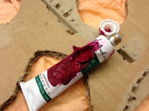
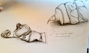
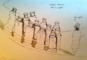
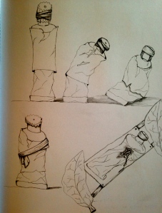
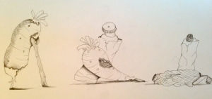
Choosing paint tubes as soldiers was quite a straight decision. Its paper wrap and cap made them look like soldiers in their uniform and helmets. The shape and type also helped me in creating characters of the soldiers.
I chose to cast pizza cutter as paramedic/doc/nurses because I think that the round blade represents the mobility of the paramedic/doctors and nurses.
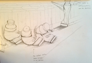
Bellow is my scenes set-up based on the poem:
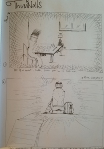
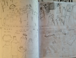
The above sets had helped me in creating possible scenes ( in thumbnails) for the trenches book.
Giving life
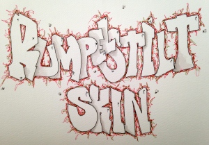
Posted: October 15, 2013 Filed under: Personification, Subject | Tags: characters, Personification, Rumpelstiltskin 1 CommentPersonification was a challenging subject to me. It means giving human traits to an object. Giving characteristics, feelings, qualities and actions. Transforms the objects into subjectified characters by imposing ourselves into the objects. How we see or treat objects will result in different perceptions for example the lighting, colour, background, voice and sound.
One of many ways in drawing objects with human traits is by composition, contrast and talkative mark. The aim is to enchant audience and engage them into the story.
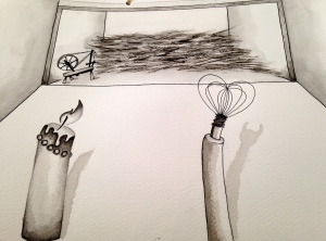
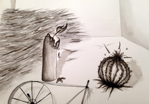
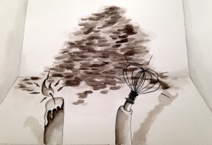
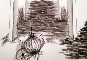
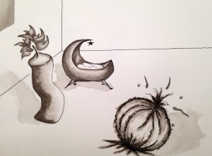
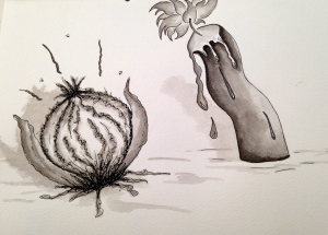
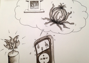
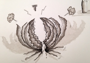
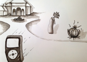
My first personification task is to depict Rumpelstiltskin story written by Brothers Grimm. I’ve chosen to use a candle, a burnt out matches, a whisk, a dry onion, and an iPod for the characters in the story.
I chose candle as the Miller’s daughter because I feel that the candle represent softness. She is a good daughter who obey her father’s and king’s wishes. I chose a whisk as the king because the wire’s form is similar to a crown and its solid materials. The king is greedy. I characterised him by adding devil’s shadow to depict his evil and dictatorial nature. The devil shadow keeps growing as the king’s greediness grows. The miller is represented by a burnt out matches. The way the matches naturally bend over gave an impression of an old age person with little personality.
- Rumpel and I
The dry onion represent Rumpelstiltskin. Onion have a distinctive smell that I consider to be stinky. The dry skin had helped me in giving him the wicked characteristic by agitated mark making.
I feel that the iPod represent a good messenger characteristic. It’s solid and its function is to deliver music to my ear.
I struggled during the characters development process. I found it very challenging to insert human traits into lifeless objects. To resolve this, I set my mind into “as if” way of thinking. I imagined myself as the objects and think how I would react to a situation. The characters that I enjoyed exploring was Rumpelstiltskin (the onion) because he has quite a complex character. He is wicked yet has a soft spot for the Miller’s daughter.
I’ve received good feedback and constructive criticism from a guest tutor (Georgina Hounsome) and my peers. They like my characters development and experimentation of mark making and tonal studies. They also like the composition and repetition works especially in storyboard where it appear as a stage/theatre. The stark interior in my storyboard works well but I’ve been suggested that I should consider to continue the similar interior/background through the end so it will give the same feeling or atmosphere to the story as a whole.
Bellow pictures explained the part where I need to improve.
Surprisingly, in the end I enjoyed this subject. It has train my brain to explore my imagination. I have a better understanding about depicting story and exploring ways to engage audience with the story.
Colour Workshop
Posted: October 10, 2013 Filed under: Colour Workshop, Subject | Tags: Amanda Sue Rope, colour combination, colour workshop, Illustrations Leave a commentContrast – Complimentary – Combination
I love colour. I love using colour in my work as I also love the intensity in black and white tone in drawing or painting. A few tips I gathered from one of my tutor, Anna Bhushan on an hour colour workshop are:
- not to follow the natural colour of the objects. For example, leaf. It’s not only green. It’s a vibrant combination of yellow, red, blue, black and white. So think about doing experimentation, be expressive and develop colour.
- always look twice at the colour of nature.
- combine monochrome palette with a touch of colour. This could create mood, effect and atmosphere.
- extend the combination or colour mix onto the image.
- think of technique e.g. collage or print-making.
- think of colour as symbol.
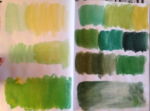
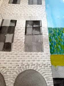
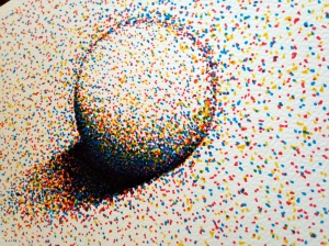
Here are a few paintings I’ve done based on the workshop:
The above painting is inspired by Amanda Sue Rope’s painting “Sky London” for one of her commission project. I specifically studied this painting because I love the tone. Her work is so detailed and uses basic or prime colours yet it creates beautiful combination. Her colour creates mood which in this painting is vibrant and lively sky of London city.
Please check her incredible works on www.alasdairmonk.com
This one is also inspired by Amanda S. Rope’s project “Courtyard, 8am”. I took an image from the internet as a reference to paint the above. The original image is city in early morning is here: http://images.canberratimes.com.au/2013/03/14/4108333/dm-gall-balloon0443-620×414.jpg
Here’s another one that’s also inspired by Amanda S. Rope’s “Southwark Cathedral, 11am” project. I have combined the prime colours to create tone.
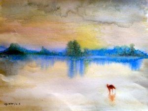
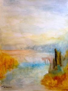
The last two paintings were made by watercolour and guache. They are inspired by J.W. Turner’s paintings “Norham Castle” and “A River seen from a hill” c.1840-5. I found studying his approach very challenging because the colour is so vibrant and the paintings contained more detail than I expected. I would like to study more Turner’s technique in my spare time.
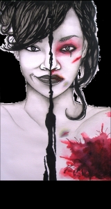
I love adding a touch of colour onto an image. It could create mood and effect. Here’s a painting in watercolour I did a few years ago for a poster project on domestic abuse. I wanted to emphasise on the visual of domestic abuse to get the attention although abuse isn’t only physical but it’s also phycological. I chose a portrait of a famous person because I wanted the victims to be able to relate their situation to the object of my image therefore persuade them to react.
Here’s fun videos by the Slow Mo guys of paints mix on a speaker. Enjoy.
http://www.youtube.com/watch?v=5WKU7gG_ApU
http://www.youtube.com/watch?v=H93n-k3SkiQ

